Through the fence: a new face for the ASRC
A new brand for the Asylum Seeker Resource Centre.
When the Asylum Seeker Resource Centre (ASRC) first opened its doors as a tiny shop offering only a few boxes of food, it was hard to imagine that in fifteen years it would become a home of hope to over 3,000 people seeking asylum in 2016. From its humble beginnings as a food bank, to now a diverse hub of services and programs that support and empower people seeking safety in Australia is testament to the community of volunteers who run, own and lead the organisation today. It’s from this community that a logo was born, a few years after its doors opened in 2001. From a garage computer, a volunteer created what we have all identified as the ASRC logo.
Humble beginnings
In the years since it opened, the need in the community for ASRC grew and now has become one of the largest providers of services for people seeking refuge in Victoria. It’s breadth of programs include everything from humanitarian services to entrepreneurship and importantly enable and empower individuals to be agents for change.
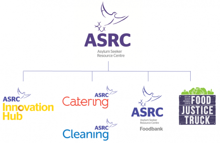
Today, the ASRC encompasses more than just humanitarian services, it has grown to include the Human Rights Law Program; a migration agency acting within the ASRC, the Innovation Hub, and three thriving social enterprises; ASRC Catering, ASRC Cleaning and the Food Justice Truck.
One ASRC
As the ASRC grew, so did its needs for the brand. It was important that the visual identity reflected the organisation’s core values, specifically; one team, empowerment and innovation. In order to build a new brand that would represent a strong, unified ASRC, its partners Maurice Blackburn Lawyers initiated a project lead by their National Brand Manager, Rebecca Hanlan and Melbourne design agency, Milo & Co who over 11 months produced ASRC’s new visual identity.
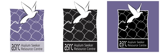
The project consolidated feedback from staff, volunteers, ASRC supporters, members of the board, donors and most importantly, its members. This process revealed that members identified with the symbol of the bird, which for them represented freedom and hope. For some, they only saw the cage, which brought up often negative emotions and memories. This was impetus for change.
From this process of discovery, a bigger, bolder ASRC evolved into what we see today.
Through the fence
The new brand has enabled the bird to break through the fence. This new visual identity builds a cohesive narrative for all areas of the ASRC as one team; one ASRC family.
A heartfelt thank you to Maurice Blackburn, Milo & C0 and all of the members, staff and volunteers involved in bringing the new face of the ASRC to life.

Connect with us
Need help from the ASRC? Call 03 9326 6066 or visit us: Mon-Tue-Thur-Fri 10am -5pm. Closed on Wednesdays.